
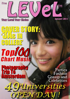
 Here is my cover from the preliminary task. The photography was taken by a compact camera which gives this image a blurry look. The masthead was designed badly and the colours didn't go with each other. The masthead isn't strong enough to draw attention because of the pink and the font isn't hard enough. The fonts and coverlines don't suit my college magazine style either. Overall, this is not a very good front cover.
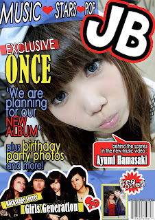
This front cover is much better because it contains more information to make this cover looks more interesting and it appeals to the target audiences more which comes from the images and use of different warm colours on the front page. Two extra images are added to the cover which give the audience an idea of the magazine contains more pictures than texts and this may appeal to my target audience who prefer more images in the magazine. I decided to use a lot of shapes and the main image looks cute which bring my magazine to the cartoon-animation Japanese style. The smaller image at the bottom shows my magazine isn't boring which comes from the expressions of the people and both my the images were taken with subjective gaze which is conventional because it makes the audiences feel more familiar and easier to identify with. Also, this cover is better because I learnt more skills using Photoshop and gained more experience using it.


Here is the image at the bottom on my music magazine front cover which was cut around the people on Photoshop. I gained the skills the use the cutting tool which is called 'polygonal lasso tool' to cut the people out from the oringal photograph. I then added a white stroke around the people as well as a drop shadow. I adjusted the size, spread and distance of the drop shadow and enlarged the size of the stroke to make it look stronger on the page.

Here is my contents page from the preliminary task for my college magazine. The masthead is a bit boring and it doesn't look strong enough and there is a lot of white space on the page. The coverlines are all in the same font and size which look messy. However, there is a lot of different images on the page which gives the page an interesting imagery. The background colour is a bad choice because it may give the audience an impression of old and boring.
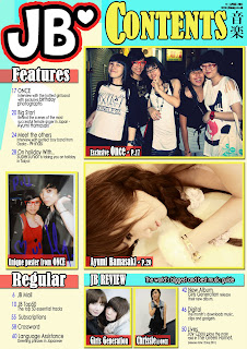 This is my contents page for my music magazine which is much better because there are a lot more information as well as images and coverlines to introduce what is included the magazine. The masthead on the top left corner makes the audiences feel familiar with the magazine and the subtitle on the top right gives the audiences a big hint what is this page about. And the small caption next to the subtitle gives the audiences an imagery of Japanese writing characters. The use of colours are a clever decision which is associated with the England flag and Japan flag. The background colour is link to the photograph at the middle which gives the impression of dreamy and sweet. The use of two different fonts doesn't mess the page up but more interesting than just use the same font all the time.
  During editing this page, I learnt to use a tool to create shapes which I drew a pink box around it and shown above. I drew different random shapes and placed them on top of the page which wrapped around the page. Also, I used this tool to draw the flower shape and the love heart shape.
No comments:
Post a Comment