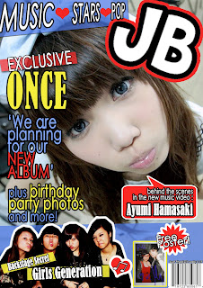
 At the top of my magazine cover is a coverline with a big masthead next to it. I have chosen to name it JB because the J stands for Japanese and B stands for British. However, I decided to put ‘Japanese’ before ‘British’ because it is Japanese based magazine. The masthead gives the audiences an idea what magazine it is and hints of what it is about. Also, it makes the audiences a feeling of familiarity and easier to memorise the name of my music magazine. The masthead is in a san - serif font, large and bold which is expected to be on the magazine cover, and there is a red stroke around it which catches the audience's attention because red is a sharp and warm colour that appeals to the audiences the most. Also, the used of red and white for the masthead is associated with the flag of Japan and the England flag which suggests that my music magazine is a British-Japanese magazine. I have decided to use the ‘Cheri’ font (which was found on dafont.com) for my masthead because it looks like cartoons characters and Japanese is famous of cartoons productions. The used of an animation font gives audiences the idea of my magazine is cute.
I have taken an image of an Asian girl with subjective gaze which is conventional and related to my Japanese magazine that contains Asian people in it. She is wearing a bow on her hair and I took this picture with a high angle to shoot a 'big-head' shot of her to be on the front cover. I have used a lot of blue on my cover which is linked to the bow and her eyes. Such as the coverline next to the masthead which is in red, blue and white and these colours represent the Japanese flag and the England flag. I have also chosen to use yellow for some of my coverlines which is another warm colour that draws audiences’ eyes. Moreover, I have used stroke for all the coverlines which makes the coverlines look a lot clearer on the front cover and I have used a lot of different shapes such as the love - heart shape at the bottom, which appears a lot in Japanese magazines and it symbolises cute and animation. There are two borders of blue at the top and bottom of my cover page because I think that those borders separate the page and keep the main image and coverlines in the middle.
The costumes and props of my music magazine are around popular things in Asia such as big glasses and popular hair style such as full fringe. Costumes and props are usually the easiest way to communicate to the audience who these people are and what they are doing, so the audiences then get the information that goes with the photograph. Also, my images help the British audience to understand Asian culture which comes from the representation of the code of dress and expressions. For example, the expressions of the main subjects in my images always look differ to the pictures which the audiences would find in a Western music magazine. The costumes that I used were various because it shows the various fashion styles in Asia.
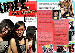
 For my double page spread, I chose to use two main colours which are on the cover page, red and blue which give the impression of the British flag and it links to the t-shirt which the girl is wearing (on the left page), the sub-title also links to the red and blue effect because it says that this band is ruling Britain. I put a large masthead on the top left with yellow stroke and it may draw attention towards the content of the article. I have used a large drop cap to start off the kicker and used a lot of red borders to separate the main article and kickers. I have decided to use a big drop cap for the kicker because the drop cap always draw the most attention and hopefully the audience will continue reading the article after the kicker. There are lots of images on my double page spread and they laid out in different angles and sizes which suggest that this band isn't boring but fun and interesting. Also, the way of the images lying out is not conventional which represents that this band is informal and new in Britain. I have also decided to put a lot of coloured borders which are used to separate texts from the surrounding features and draw audience’s attention towards the article. The coloured borders idea was influenced by the ‘X-Factor’ magazine whereas the borders were lying at different angles and creating a messy layout around the pages. I have separated my article into columns which it would be easier for the audience to read and follow the texts. There are borders behind the texts which are also helping the audience to follow the article. I think it looks more organised and easier to read. The language that I used to write the article is fairly simple because it is a relaxing and informal music magazine which is targeting young audiences, and nowadays young audiences normally prefer to read simple articles during leisure time to relax.
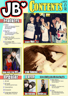
 For my contents page, I have used the coloured borders wrapping around the page at the top and a big masthead at the top right corner. I decided to put five images on my contents page because it suggests that my magazine contains more pictures than texts which would appeal to my target audience. I have used the four main colours on my contents to make the audience feel familiar with my magazine as well as the same fonts that I have used for my cover page. I decided to put the coverlines into blocks of texts and keep the coverlines simple will benefit the audience and makes it easier to read.
No comments:
Post a Comment