
How did you attract/address your audience?

This is my front cover. I have chosen to put a large masthead at the top right hand corner with a red stroke which draws the audience's attention to it and makes it easier for the audience to remember it. The coverlines at the top; 'music, stars and pop' go well with the genre of my magazine which is around pop stars and music. I have used the word 'exclusive' to make the coverline stronger and stand out more than the other coverlines. Because the band 'Once' is the feature story for this issue and they are popular, their fans would buy my magazine just for them. The coverline below is a pull quote from the main article and I have highlighted 'new album' in red which connotes urgency and something special. The additional coverline below it says more about this feature story with highlighted 'birthday party photos' in yellow because yellow is also an attractive colour and it is associated with happiness. For the cover image I took a picture of my friend who pretended to be a famous singer. I added a bubble introducing the story of her being on the cover. I chose this image to be my cover picture because I think that she establishes Japanese culture very well which comes from her hair style, wearing colour contact lenses, mainly her expression and posture. At the bottom of my cover, there is a girl band and I only added a small coverline for them because they are not the main feature of this issue. There is also an unique selling point which comes from the free poster of 'Once'. I have decided to give offers to the audiences because 'Once' is my feature artists for this issue and this unique selling point is attractive for their fans and it may attract a wider audience to buy my magazine. There is the barcode, dateline and issue number at the bottom right a corner, all features which are conventional for a magazine cover.

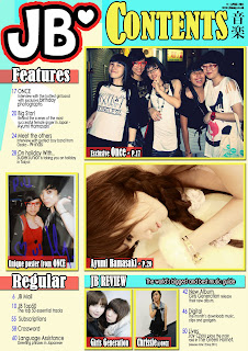
To the left is my contents page. I put a big, bold masthead at the top left hand corner which reminds the audiences what magazine it is and helps them feel more familiar with my magazine. I put the word 'contents' next to it which shows the audiences this is a contents page and they could find the page numbers on this page. There is the dateline and the website at the top right hand corner which is a conventional feature and it will take the audiences going online to the website which makes my magazine become a synergy production. There are Japanese characters below which symbolises that my magazine is linked to both cultures, Japanese and British. I have put five different images on this page which suggests that my magazine contains more pictures than texts and it appeals to my target audiences who prefer more images. There is another conventional design to have two parts - the 'features' section and the 'regular' section. I have decided to put all the big stars in the features section and I have made up some coverlines which are popular for the regular section, such as 'crossword' and 'language assistance'. the 'language assistance' may not be popular for other style magazine, however it goes well with my Japanese style magazine and it may help some of the audiences to know more about the culture and language. Other than that, I have added a 'review' section at the end where it introduces new gadgets and products to the audiences and it makes my magazine become a synergy production whereas audiences buy product via my magazine.

This is my double page spread which is an article of an interview that I had with the band 'Once' after they have been in a gig in England. I found a suitable font on a website 'dafont.com' and placed it at the top left with an angle and added a yellow stroke for it. I then placed a subtitle below it which briefly says what the article is about. There is a kicker below the subtitle with a drop cap because drop cap quite often draws attention and hopefully the audience would continue reading the rest of the article. There is another kicker at the top on the right page to start the article and briefly introducing what they have been doing and why they are the featuring story of this issue. I then formed my article into question and answer form to make it easier for the reader and I used fairly simple language for the article which appeals to my target audiences. I added seven extra images as well as the main picture on the left, as I said that my audiences prefer more images so I have put a lot of photos on my double page spread. I also added captions for those pictures, drop shadow and strokes are used for those photographs too. I mainly used red and blue for my double page spread because they are the colours that associated with the England flag. However, the white space and red associated with the Japan flag.


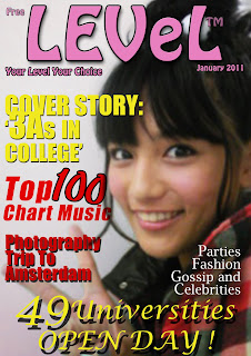 Here is my cover from the preliminary task. The photography was taken by a compact camera which gives this image a blurry look. The masthead was designed badly and the colours didn't go with each other. The masthead isn't strong enough to draw attention because of the pink and the font isn't hard enough. The fonts and coverlines don't suit my college magazine style either. Overall, this is not a very good front cover.
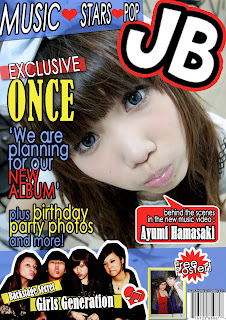


 This is my contents page for my music magazine which is much better because there are a lot more information as well as images and coverlines to introduce what is included the magazine. The masthead on the top left corner makes the audiences feel familiar with the magazine and the subtitle on the top right gives the audiences a big hint what is this page about. And the small caption next to the subtitle gives the audiences an imagery of Japanese writing characters. The use of colours are a clever decision which is associated with the England flag and Japan flag. The background colour is link to the photograph at the middle which gives the impression of dreamy and sweet. The use of two different fonts doesn't mess the page up but more interesting than just use the same font all the time.
  During editing this page, I learnt to use a tool to create shapes which I drew a pink box around it and shown above. I drew different random shapes and placed them on top of the page which wrapped around the page. Also, I used this tool to draw the flower shape and the love heart shape.

 This is a screenshot of my coverpage on Photoshop and it is just to display the tools and features surrounding the main canvas. This includes the most useful tools at the left hand side, the layer panel and the colour panel at the right hand side. Before this project, i had only used photoshop a few times and I did not know half of its functions. Now, I have learnt to use all the features and tools to access an editing project and I have found each of the tools are helpful in different ways.
 Being able to use modern technology to produce a media product instead of traditional way is an advantage of saving time because modern technology allows you to do and edit things immediately and if you want to add something, you only have to copy and paste it onto your work. Here is another screenshot of my contents page in Photoshop. It was taken of the finished product and there are still some ruler lines on top of my contents page to help me judge the correct columns and gutters. I found this useful because it helps me to line up my coverlines a lot easier and quicker. And this is an example of convenient and an advantage of using modern technology. If it was a paper copy it would be much more difficult to line up my coverlines, I would have to draw ruler lines by hand.
 Here is also a screenshot of my double page spread being edited on Photoshop. The masthead is editing by using the blending option tool where you can add strokes, shadows and etc. to texts. I learnt to add strokes by using this tool where you just have to tick one box then Photoshop will do it to you. If I had made this in a traditional way then I would have to draw the stroke by hand and I couldn't edit it immediately. Also, to do this work by drawing would be a disadvantage for me because I can't draw at all and it would become a lot more difficult.
 This is a logo of dafont.com where inspirations of my fonts come from. I have chosen quite a lot of fonts from this website and I have this helpful because there isn't many different fonts on Photoshop and I managed to copy and paste some fonts onto Photoshop. This is the most helpful website for doing this project because without technology, I wouldn't be able to use different fonts for my magazine.


